
03 Treatment Tracker
Helping patients find success during complex treatment journeys
A mobile app that helps movement-disorder patients stay on a complex treatment by making their progress visible.
- Role
- Product Designer
- Team
- Alec DeNapoli, Jenna-Leigh Meola, Chris McGillicuddy, Chandlyr Jackson
- Timeline
- 2023
- Tools
- Figma
A note on confidentiality: to protect the product's IP, the details, copy, assets, and branding shown here have been reworked for this portfolio.
The problem
Progress is hard to recognize.
The titration is genuinely complex: patients mix three tablet strengths to hit each incremental dose on the way to their effective one. Without a clear sense that they're moving forward, many drop off before they get there.
Patients feel unheard.
It's hard to convey the social, emotional, and physical toll of uncontrolled movements, and patients often leave appointments feeling their experience didn't land with their provider.
New treatment is risky to adopt.
Patients already juggle many medications daily and are wary of anything that might disrupt a hard-won stability.
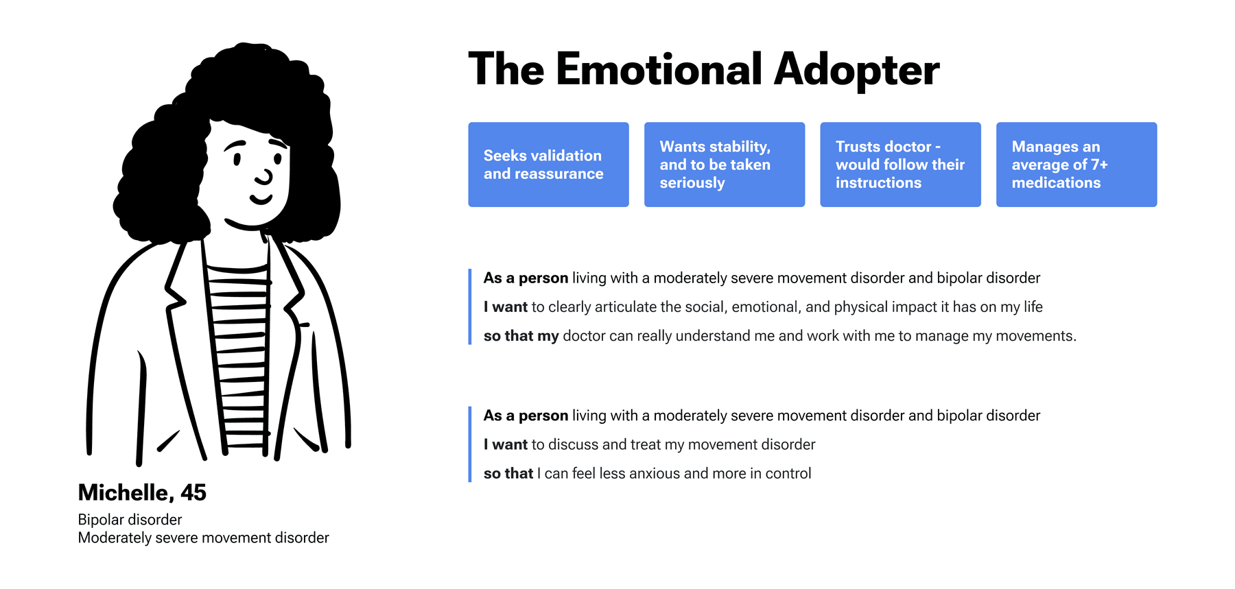
How might we empower patients to take an active role in their treatment, help them find their effective dose, and reduce the stress along the way?
The approach
We started from a large base of existing marketing and ethnographic research on the patient experience, then expanded the jobs to be done — covering the patients themselves, the caregivers who help with treatment, and the healthcare professionals treating them.
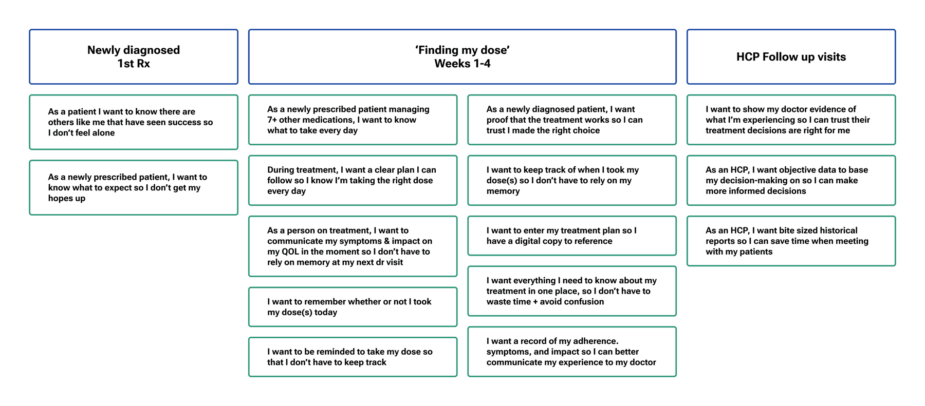
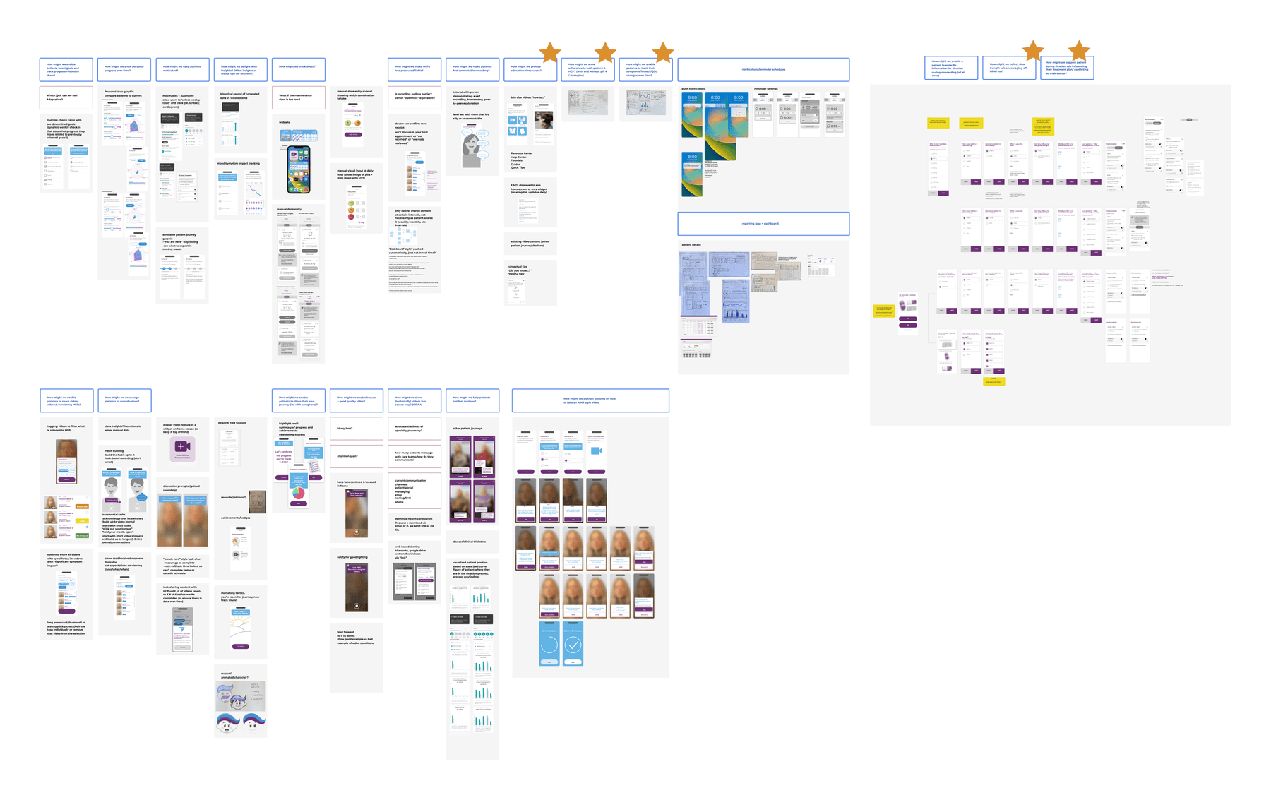
From there we wrote "how might we" statements and ideated against them, moving from messy sticky-note sketches to low-fidelity digital mockups. We deliberately generated multiple solutions per HMW and flagged the blockers, open questions, and concerns worth raising with stakeholders. For two weeks the room became a sticky-note war room in the run-up to user interviews.
What we learned
We used those concepts as stimuli in user interviews to test feasibility. The goal was to gauge the usefulness and usability of the app and HCP dashboard, and to gather the contextual detail that would shape the design.
What resonated
Daily reminders
Showing which tablets to take, and when — especially valuable early, before treatment becomes routine.
"Reminders would be good. If you're just starting out and it's not part of your routine." — Patient 1
Quality-of-life check-ins
Tracking how the condition affects daily life gave patients a reason to keep engaging, and gave clinicians a fuller picture.
"It's helpful to get a deeper understanding of how the condition is affecting them and what's working." — HCP 5, neurologist
Movement progress videos
A novel, objective, longitudinal record of adherence and symptom change — and a shared talking point for appointments.
"I want my doctor to be on the same page. The videos could be a talking point for our next appointment." — Patient 12
What we designed around
Time
A long setup or heavy activities risked disengagement. We streamlined onboarding and auto-populated as much setup as possible to cut steps.
Data liability
Unreviewed patient-shared data carried legal risk. We kept all data stored on-device, shown to the HCP in person rather than reviewed asynchronously.
Physical limitations
Involuntary movements make precise tapping hard. We used larger-than-standard touch targets to keep the experience accessible for lower dexterity.
What we shipped
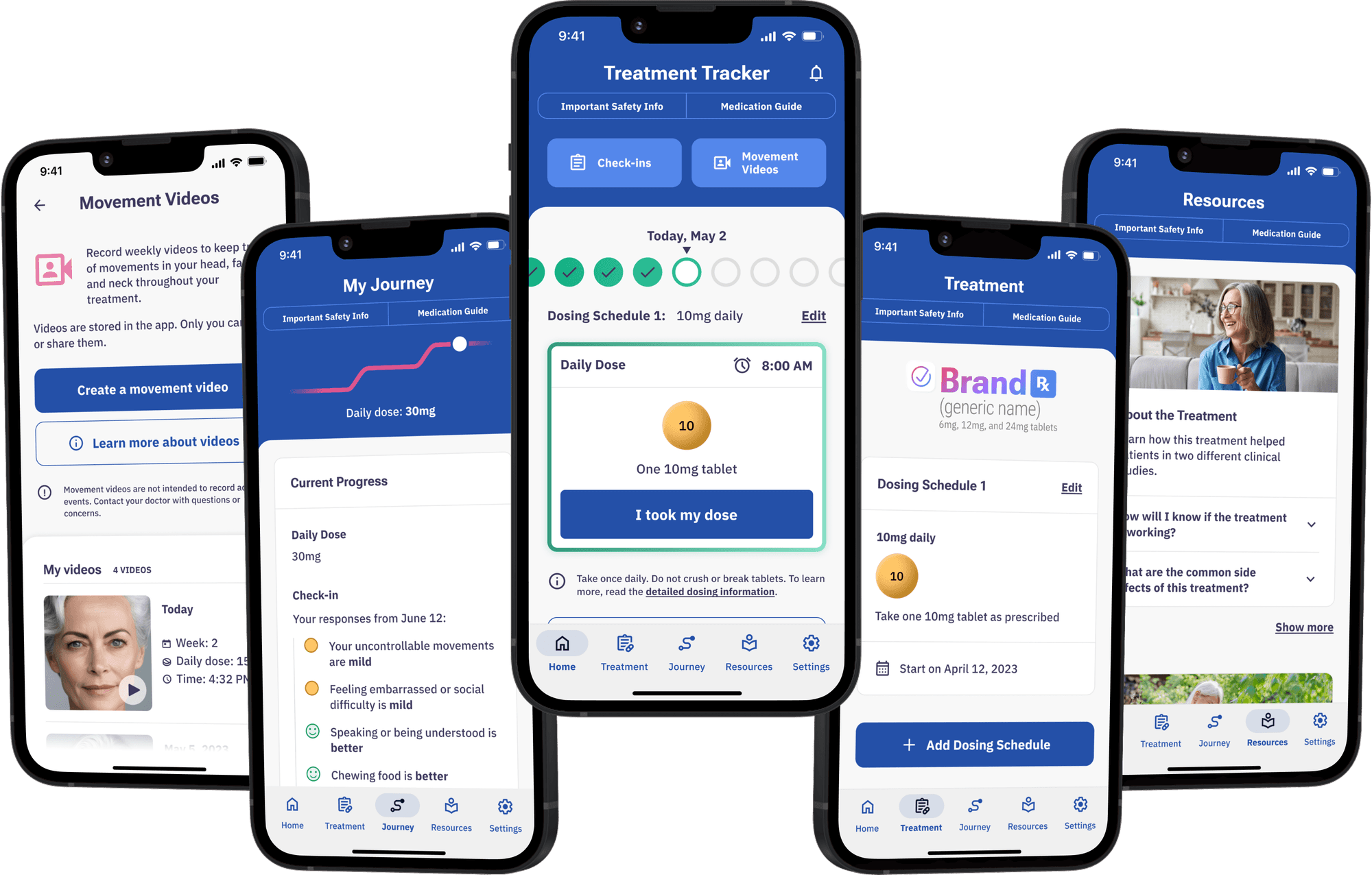
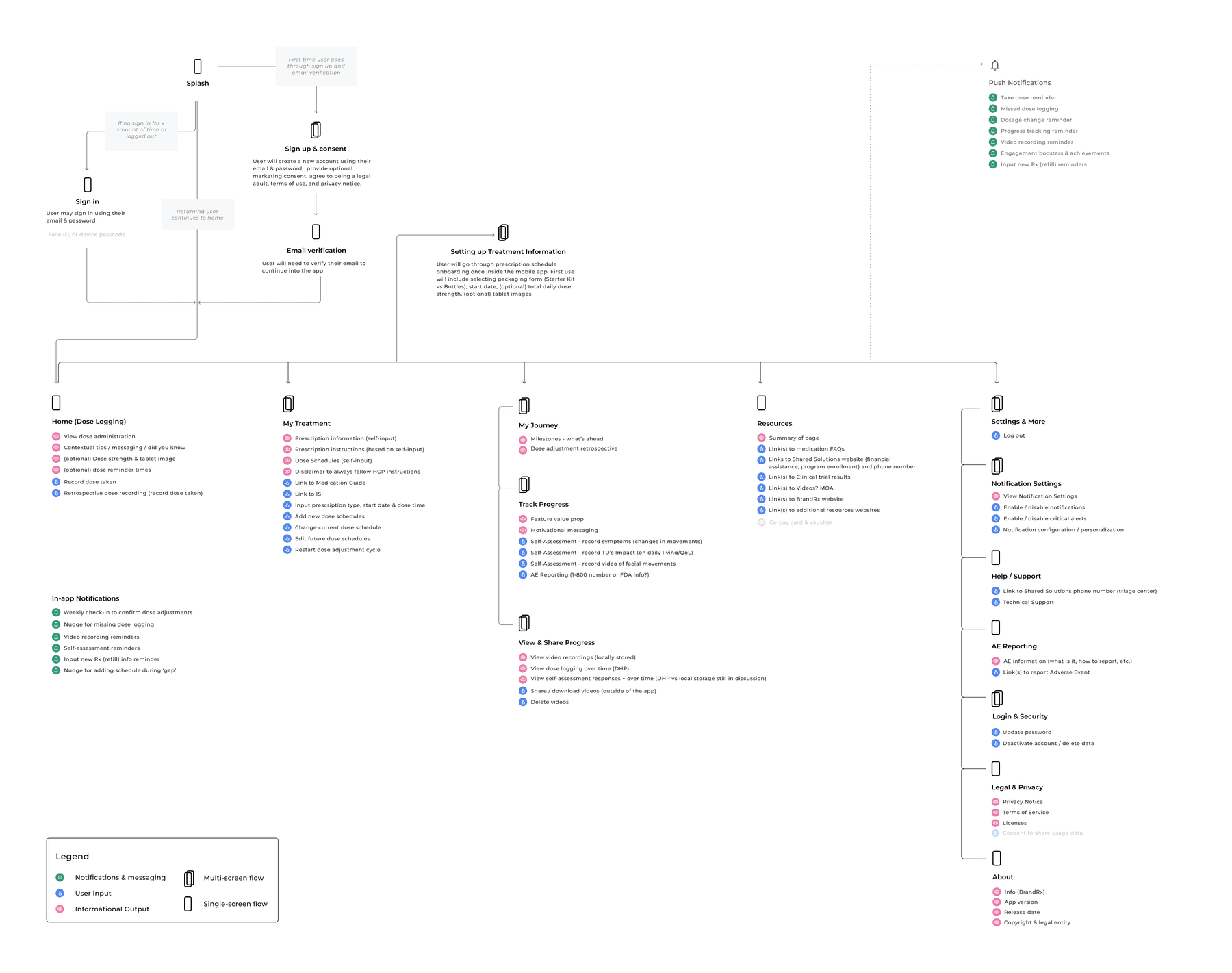
We designed an elegant experience for a complex treatment process in a highly regulated pharmaceutical space. Getting the information architecture right took real work. As complexity grew, features spread out and settled in their own dedicated spaces.
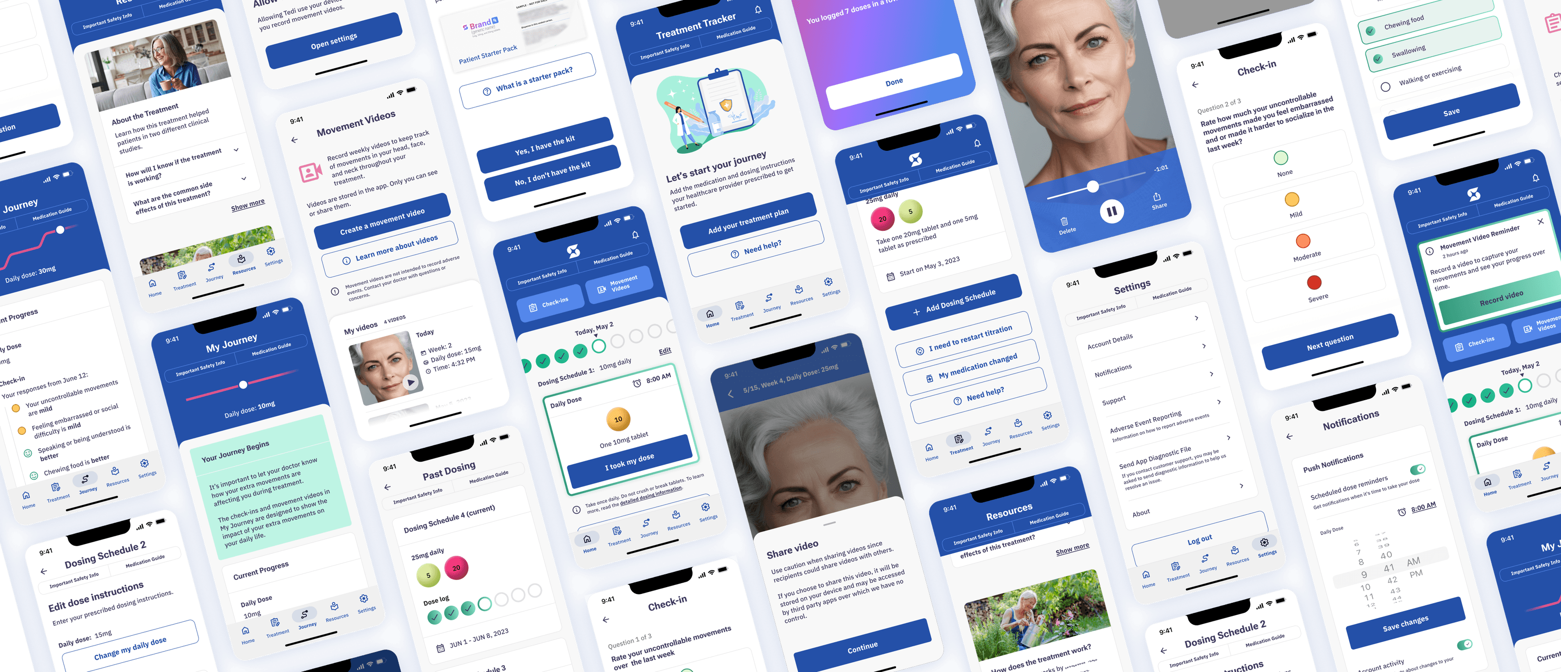
Home
Log doses, view medication details, track adherence, jump into other sections, and manage notifications for progress tracking.
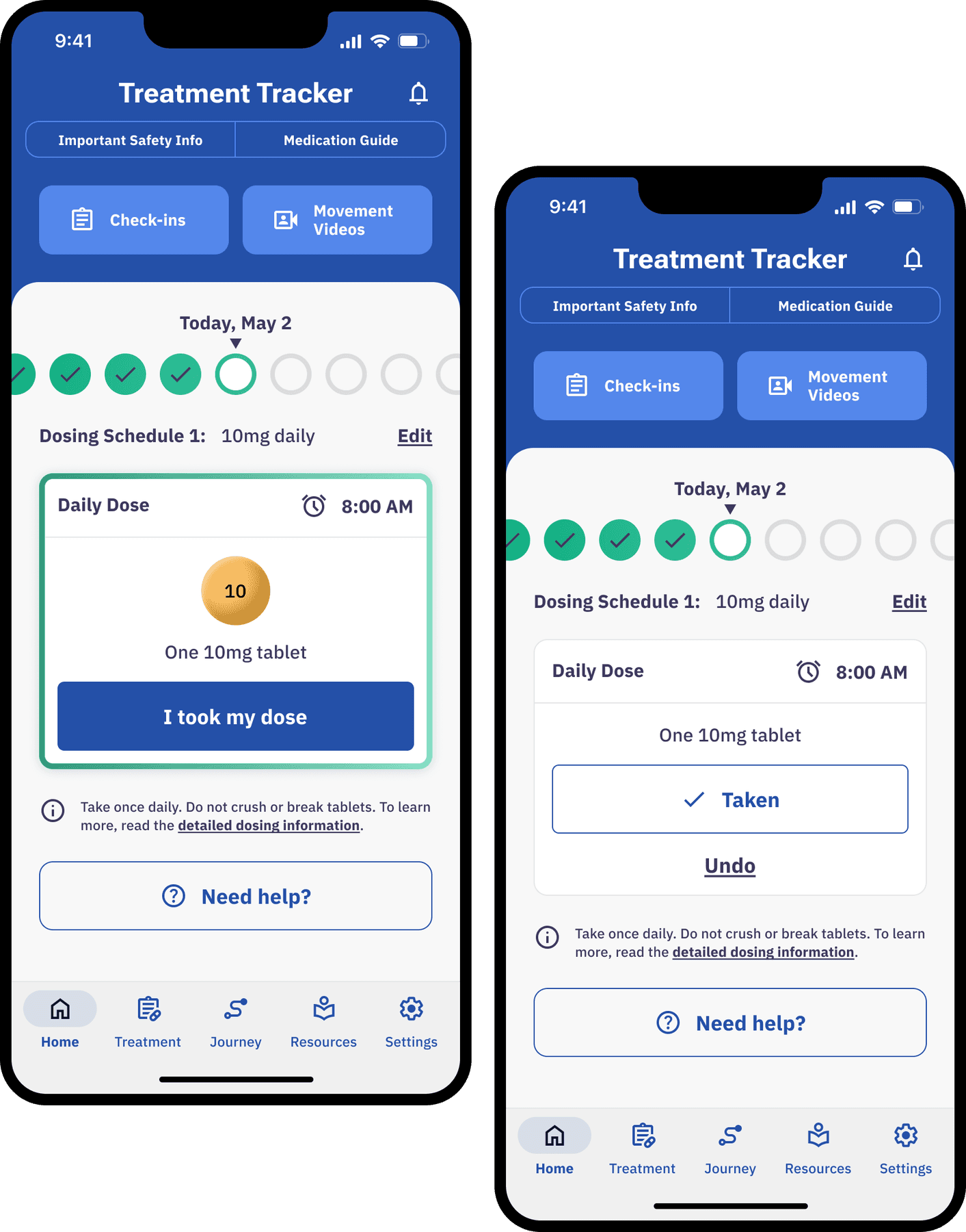
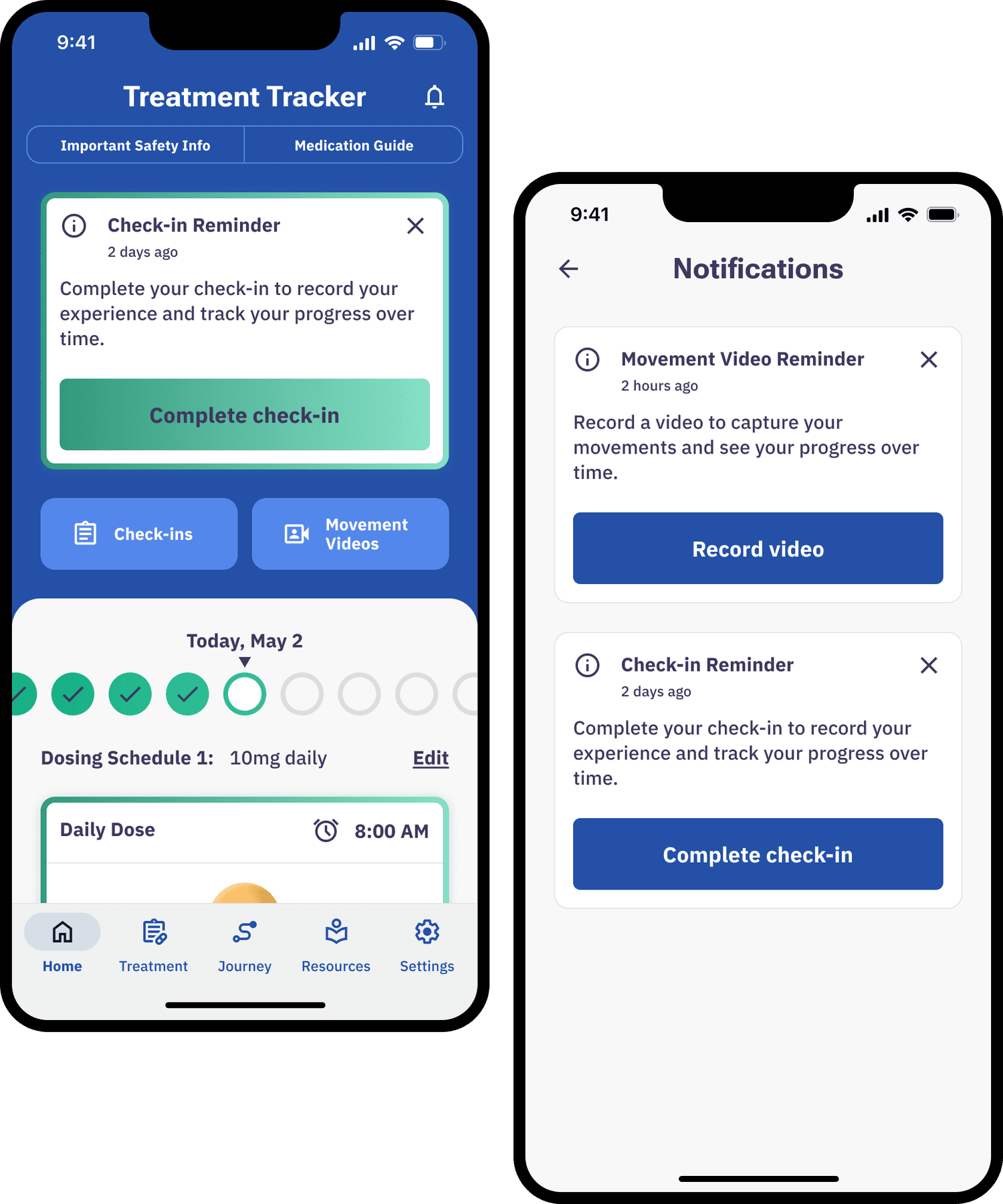
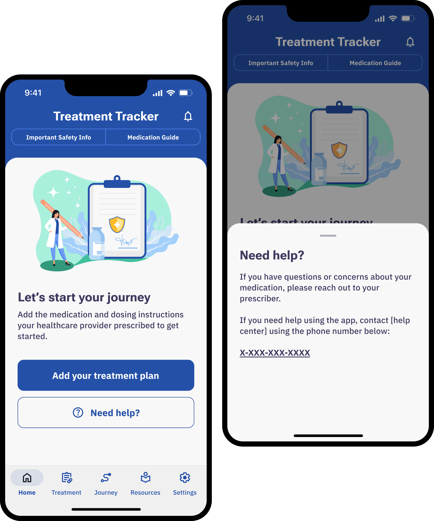
The design challenge here was constant information triage. Adherence progress, today's tablets, the active schedule, FAQs, progress activities, and paths to review or edit it all competed for the same screen. As the app architecture shifted, so did Home — most components went through dozens of iterations to land the right priority.
Treatment
Create and edit titration schedules, and see what's current and upcoming so patients know what to expect.
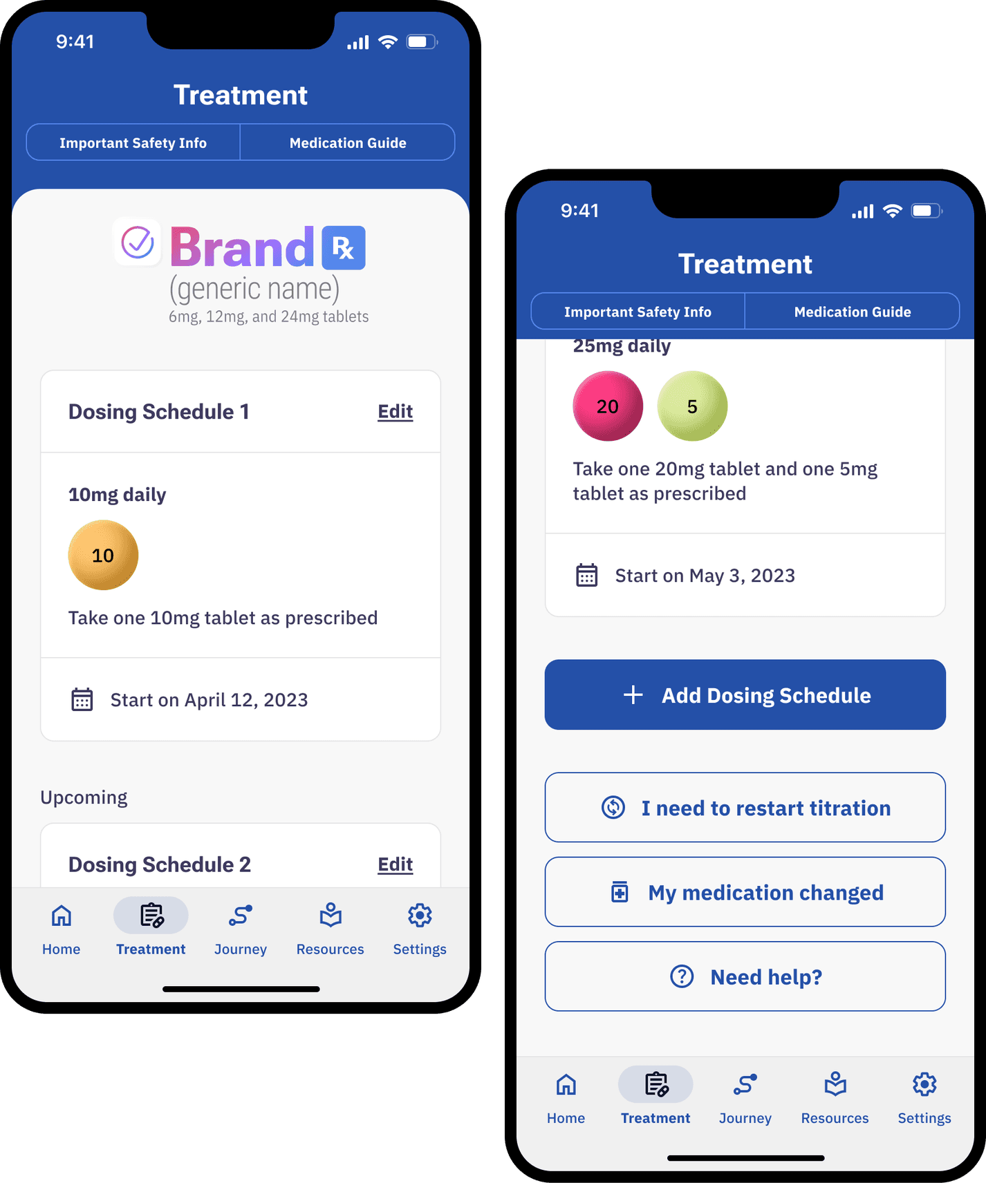
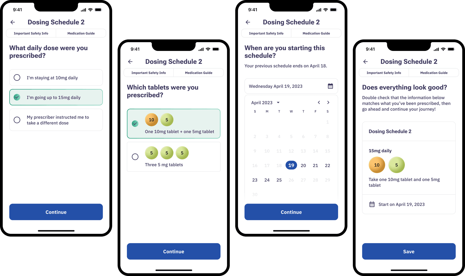
We consolidated what used to be several separate edits (medication type, reminders, schedules) into a single edit path per schedule, and moved dense regulatory documents into the header and settings tab so the core task could breathe. Screens started very dense and gained room as we went — enough to communicate every detail without overwhelming the patient.
Journey
Complete progress-tracking activities like weekly check-ins and movement videos, and review treatment progress and history.
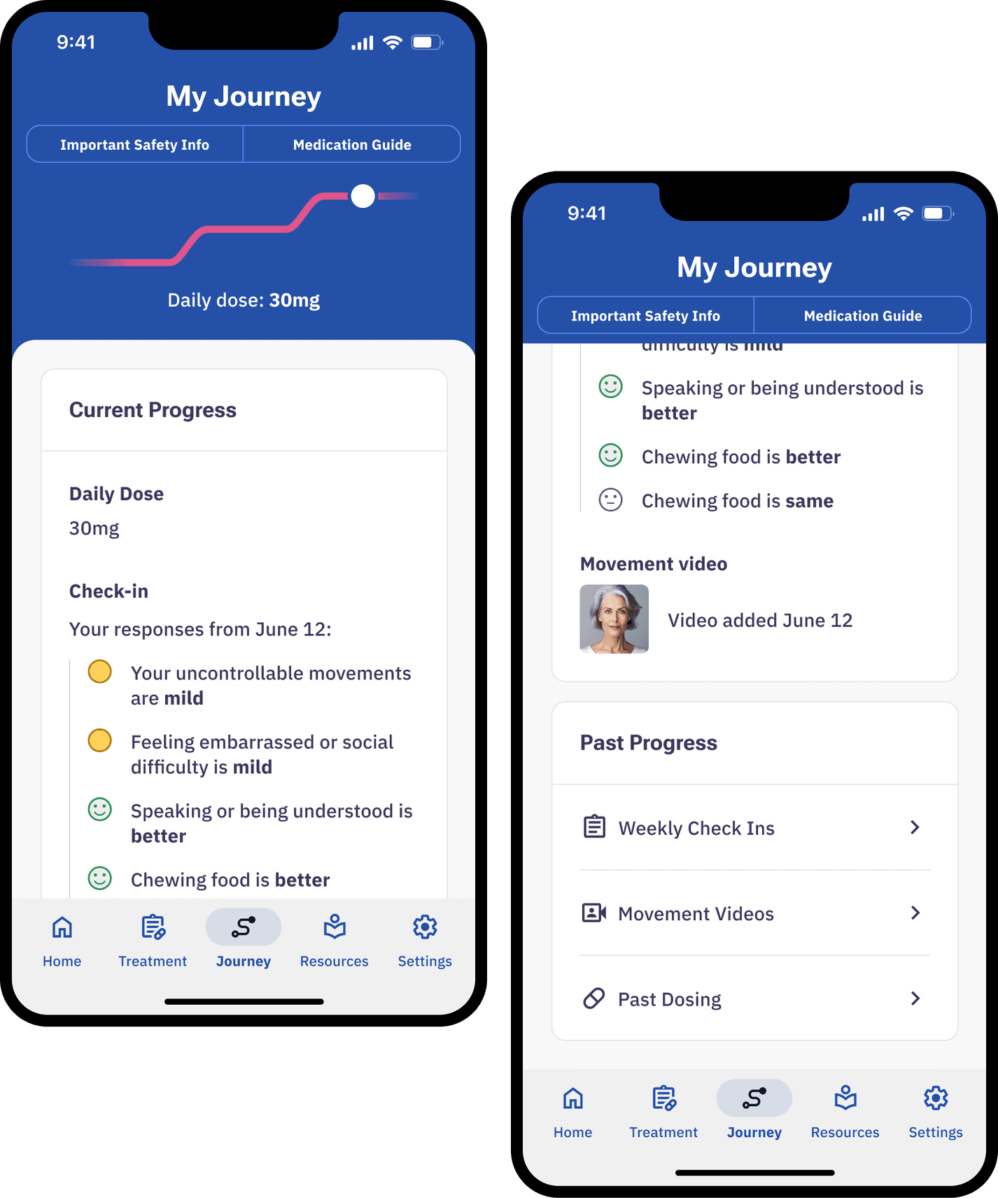
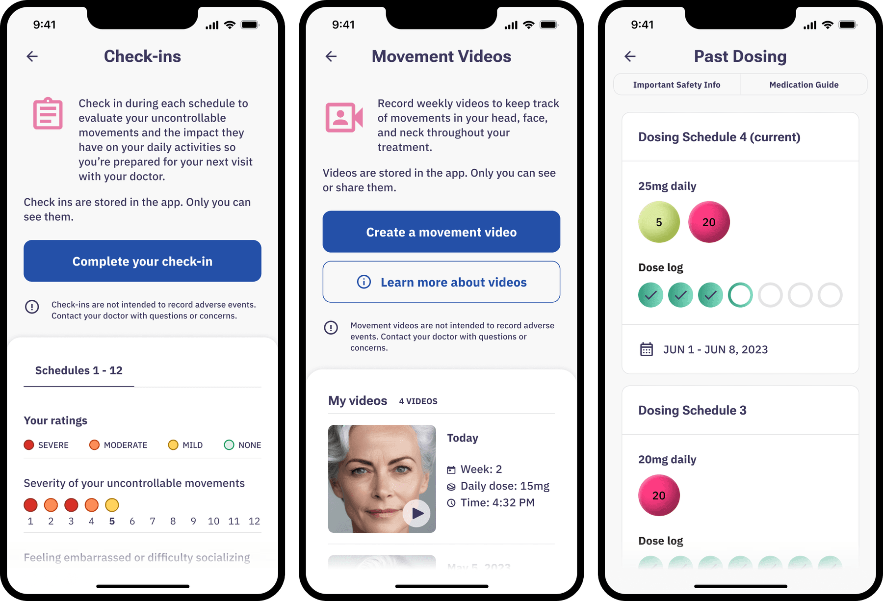
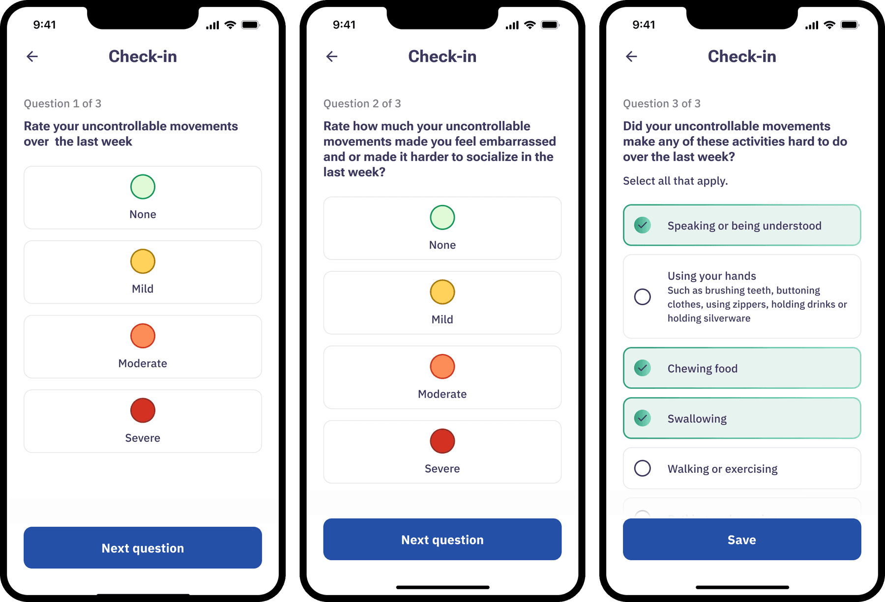
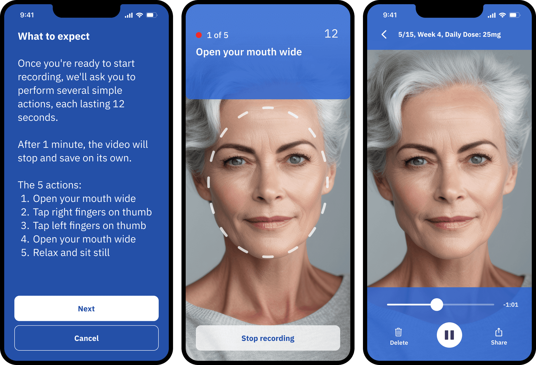
I contributed the flows, interview stimuli, mid-to-high-fidelity mockups, and the dose-change visualization. Journey was always meant to be a place for motivational reflection — showing patients how far they'd come and keeping them accountable to their own tracking. Business and regulatory constraints led us to an elegant line graph charting each patient's dose change over time.
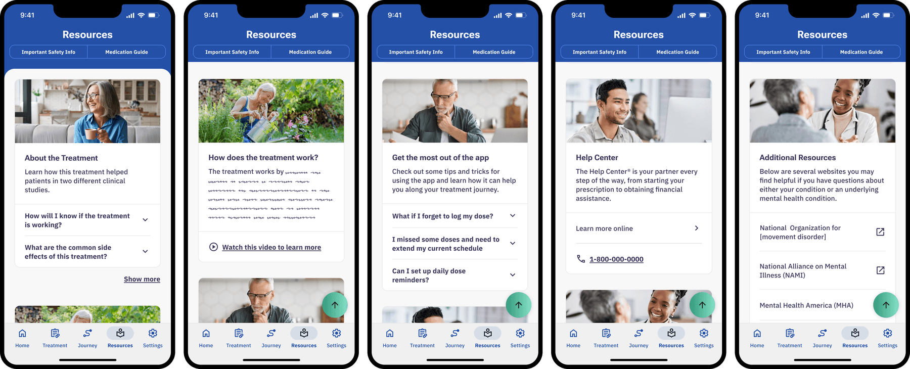
Resources
Learn how the treatment works, how to use the app, when to expect progress, and how to connect with outside organizations.
Reflection
This was a fast, end-to-end push to MVP — taking a regulated piece of software from research and concepting through testing and validation, all the way to production. The recurring design problem was the same one the patients face: a lot of dense, clinical information that has to become something a person under real physical and cognitive load can actually use. Getting that balance right, section by section, is what made the difference between an app patients would abandon and one that helps them stay in it long enough to find their dose.